Designing a Critical Alert System
“We want to be the big red button that lets everyone know some type of information.”David Anderson, CEO of Mimo Monitors
Overview
Campuses had no reliable way to reach everyone on site. Public safety and IT sent messages by email, text, website banners and Teams or Slack, and in an emergency, people may not have their phones.
“They don’t necessarily get the info until after the fact, and that is an issue.”
Flashcast sends one alert to every screen on campus at once, or to one building, floor or room.
Impact
A 30-minute scramble became a two-second send.
Key challenges & decisions
Three problems stood between the first version and a tool public safety and IT would trust in an emergency.
Cut the steps, keep the safety
- Problem
- In v1, a fire alert took 13 clicks across three steps, with the cursor crossing the screen between nearly every one. Most emergencies are sent by public safety staff who rarely use the tool, under stress. But the faster an emergency is to send, the easier it is to send by mistake.
- Decision
- Give emergencies their own button. Point at it, pick the emergency, click Send. The message, “now” and every group are already set.
Live prototype
Try v1, then v2. The counter tracks your clicks and cursor travel
Replay
A fire alert sent in v1, then in v2
Try the live prototype on a computer.
Why it works
A fire alert in 1–2 seconds, down from about 20, and still never in one click.
- 01Defaults replace stepsThe message, “now” and every group are already set, so checking means reading one screen, not clicking through three.Clicks132Someone who rarely opens the tool has nothing to fill in.
- 02Choosing is the safeguardPicking the emergency is the deliberate act. Send opens on Emergency’s spot, never under a type, so a double-click can’t send.One-click sends0Faster didn’t make it easier to send by mistake.
- 03Pointing is freeHovering shows the types before the hand arrives, and Send is one short move away. On touch, a tap keeps them open.Cursor travel, px5,900860Less hunting across the screen under stress.
Familiar beat minimal
- Problem
- Device Management had two columns: the group tree on the left, what’s inside the selected group on the right. A designer pushed back: it wasn’t minimal enough, and in a high-stakes tool, more on screen means more to process.
- Decision
- Test it instead of debating it. In an A/B test, admins chose the tree, because it mirrors the Windows tools they’ve used for decades, and Finder for Mac users. I kept it.
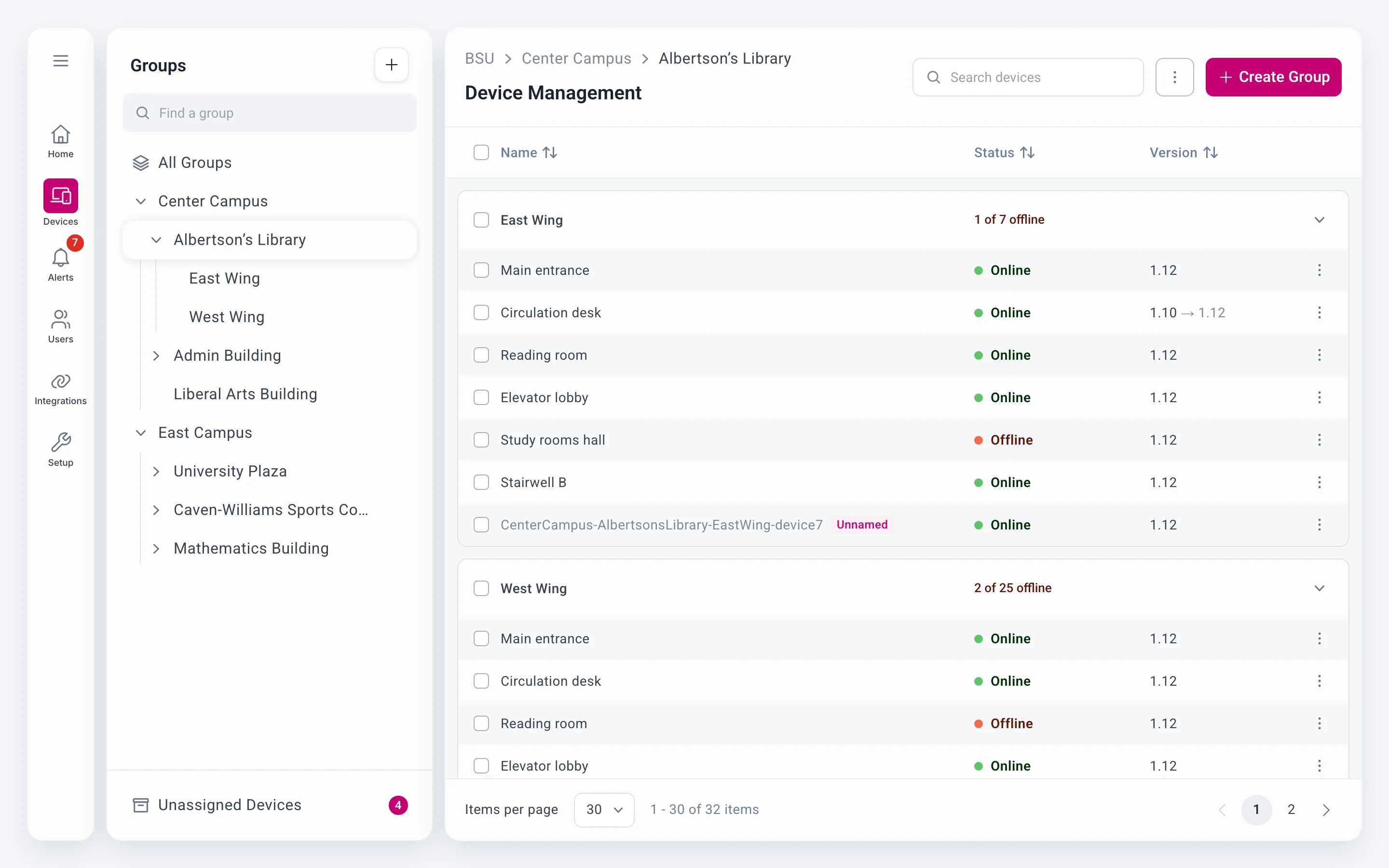 Flashcast
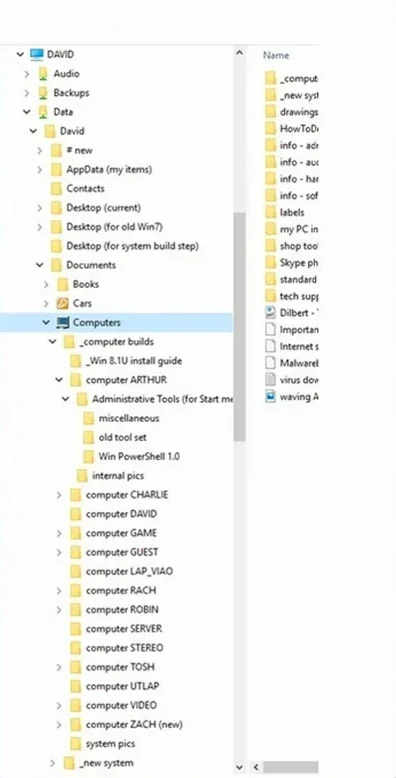 File Explorer
The same campus in each, the same group picked. Admins already knew the shape.
Why
- 01Familiar is fastAdmins act on patterns they already know. An emergency is no time to learn a new one.
- 02Minimal isn’t the goalFewer things on screen only help if people still know where they are. The tree always shows it.
- 03Tested, not arguedThe A/B test picked the tree, and in usability testing every admin navigated it with ease.
Show what they need, not everything they asked for
- Problem
- Admins asked to see everything about every alert, and the shipped page showed it: six columns on 200 rows, and approvals on a separate page.
- Decision
- One list in the order admins act: Needs Approval first, then Live and Upcoming. Each row says what the alert is and when it’s on; everything else opens beside the list.
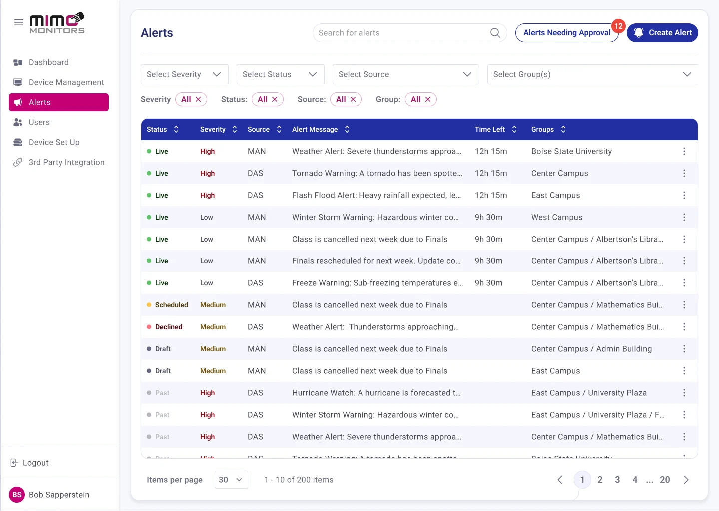
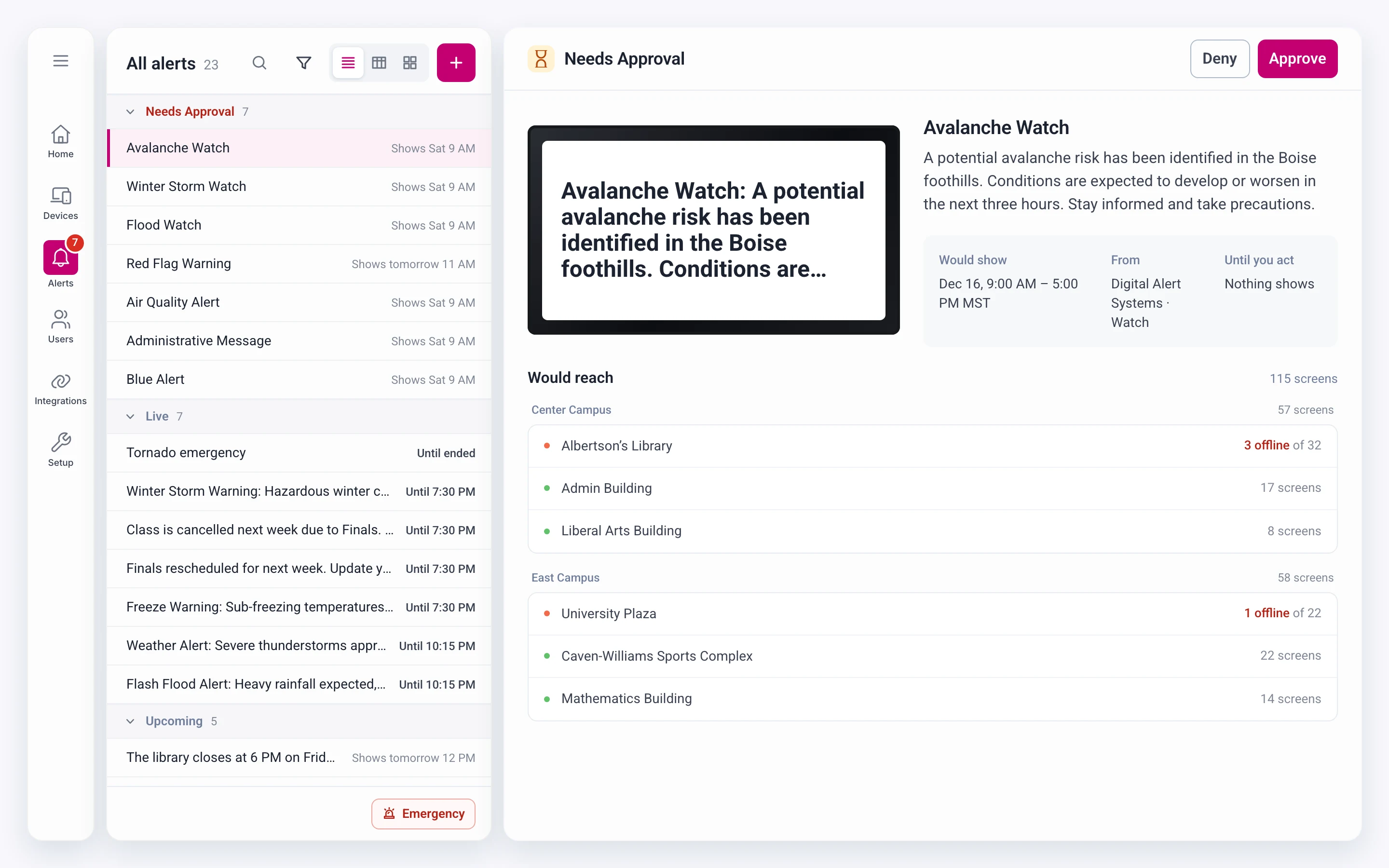
- Used
- Asked for
- Message100%
- When it’s on86%
- Status · became the list’s sections79%
- Groups21%
- Severity7%
- Source14%
Why it works
What needs an admin is at the top, and nothing waits on a page nobody opens.
- 01Used often, kept closeThe message and the time stay on the row, because every decision used them. Where an alert sits says whether it’s live, so the row doesn’t have to.Facts per row62200 rows an admin can actually scan.
- 02Approvals can’t wait unseenAutomated alerts used to sit on a page admins had to remember to open. Now they lead the list and the Alerts badge counts them.Places to check21No one finds out “after the fact.”
Takeaway
Under pressure, defaults beat options and familiar beats minimal.
- 01Fast and safe can be one gestureCutting clicks didn’t mean cutting checks. The safeguards moved into how an alert is sent: point, pick, then a deliberate second click.
- 02Principles aren’t rulesMinimalism is a good default, but admins’ habits came first. Years in File Explorer meant they read the tree without being taught.
- 03Watch what people useAdmins asked for every column but relied on a few. What they did in sessions shaped the page more than what they asked for.
- 04Design is translationThe work was turning the CEO’s big red button, engineering’s constraints and what admins needed into one tool.